The best luxury holiday cards come from stationers with a distinctive eye: Greenwich Letterpress for personalized wit, Scribble & Daub for hand-painted letterpress, Choosing Keeping for an unusually good London edit, and Dear Annabelle for illustrated winter correspondence. This guide brings together ten selections, one from each source, including engraved Christmas cards, artist-designed paper constructions and a beautifully made family photo card. Each earns its place through the particular design, its materials and the pleasure of receiving it.
Some of the most appealing discoveries come from small presses where you can still identify the person who drew the image and the workshop that printed it. Others come from a museum shop or an established engraver having an excellent seasonal moment. A ladder reaching toward a crescent moon, a pair of dancing frogs, a Christmas tree taking a taxi through Manhattan: there are several ways to wish someone well. The interesting part is finding the image that makes you think, immediately, of someone you know.
Paper, Please is Dandelion Chandelier’s ongoing series on the material culture of writing, featuring luxury stationery, paper, pens, ink, and print objects prized for tactility and permanence.
At a glance: ten distinctive selections · independent letterpress studios · British paper discoveries · engraved winter notes · personalized correspondence · cards worth keeping
the luxury holiday card shortlist
| Stationer or retailer | Selected card | Printing or construction | Format | Choose it for |
|---|---|---|---|---|
| Greenwich Letterpress | Festive Frogs | Letterpress on cotton paper | Personalized flat stationery; minimum 50 | A seasonal note with private humor |
| Dear Annabelle | Frosty Notecards | Flat printing with engraved outlines | Ten cards with coordinating envelopes | Winter wishes and après-ski thank-yous |
| Hammerpress | Holiday Treats — Rocket Red | Letterpress on recycled white paper | Individual folded card with red envelope | Someone who considers baking a love language |
| Scribble & Daub | Moon & Stars | Letterpress and individual hand painting | Individual card with matching envelope | A friend with a celestial imagination |
| Choosing Keeping | Fox in the Snow | Letterpress; made in the U.S. | Individual card with envelope and printed seasonal greeting | A winter scene without a religious message |
| Cambridge Imprint | Winter Trees Triptych | Lithography in hand-mixed colors; folding construction | Individual three-dimensional card with envelope | Someone who will give it mantel space |
| Meticulous Ink | Softer and More Beautiful | Letterpress on 300gsm cotton card | Individual folded Christmas card | A reader who notices typography |
| Dempsey & Carroll | Christmastime in the City | Flat printing with engraved accents | Ten folded cards with lined envelopes | A New Yorker, present or homesick |
| Sugar Paper | Warmth of the Holiday | Letterpress, foil and an applied photograph | Personalized flat photo cards; minimum 50 | Family correspondence with beautiful production |
| MoMA Design Store | Snowstar | Pop-up construction and foil embellishments | Eight cards with white envelopes | A design enthusiast who enjoys a reveal |
paper with a private sense of humor
A good stationer has something in common with a good bookseller: a recognizable sensibility, expressed through hundreds of small decisions. You begin by buying a card and end by developing a relationship with the place. That pleasure of finding your people through their paper is central to Paper, Please.
For holiday correspondence, a little eccentricity travels well. It gives the recipient something to recognize about you before reaching your signature.
1. greenwich letterpress: festive frogs.
Two frogs appear to have found the dance floor, and the effect is unexpectedly persuasive. Set in one corner of an otherwise spacious card, they introduce just enough mischief to make personalized stationery feel like an invitation.
Greenwich Letterpress, opened by sisters Amy and Beth in 2006, brings a particular West Village affection for nostalgia and small oddities to its paper world. Festive Frogs is printed on cotton paper, with a choice of two weights and quantities beginning at 50. Allow three to four weeks for printing after design approval.
This is personal stationery for a handwritten seasonal message rather than a conventional printed Christmas greeting. The generous blank space is part of its appeal: enough room for a proper note, with the frogs handling the entertainment.
2. dear annabelle: frosty notecards.
Dear Annabelle’s place cards are already part of my Thanksgiving table, so its winter correspondence feels like a natural extension of the same hospitality. Frosty gathers five illustrations, including a winter hat, snowflake and skis, across ten heavyweight cards with coordinating envelopes. Flat printing supplies the color; engraved outlines give the drawings another dimension.
There is something appealingly specific about a ski-themed note arriving after a snowy weekend. The set allows that kind of small adjustment: choose the image for the person, then let your message name the memory.
These would also be lovely to have waiting at home when the holiday visits end. A winter card can carry a thank-you well into January without looking as though it missed Christmas.
3. hammerpress: holiday treats — rocket red.
Frank Norton’s Holiday Treats is a cheerful inventory of seasonal appetite: a candy cane, cookies, a gingerbread figure, a pretzel and a pink confection, gathered against a bright yellow field. The rocket-red envelope makes its intentions clear before it is opened.
The card is letterpress printed by Hammerpress in Kansas City on recycled white paper and left blank inside. The individual card is the selection here.
Send it to the friend whose December involves cooling racks, or the one who knows exactly which bakery deserves a detour. Its confidence lies in the color and composition. Everything looks delicious, and nobody has attempted to make a gingerbread person elegant.
the british paper trail takes a few delightful turns
British stationery has plenty of room for an eccentric illustration, a theatrical fold or a slightly improbable moon. These selections move from an artist’s studio to an independent London shop and a patterned-paper specialist, each with its own way of making a seasonal greeting feel particular.
4. scribble & daub: moon & stars.
A slender ladder reaches toward a yellow crescent moon, surrounded by a scattering of stars. It is a wonderfully economical drawing: a little ambition, a little absurdity, and quite a lot of possibility.
Scribble & Daub founder Caroline Kent was a contemporary-art curator before establishing the company. Her original pen-and-ink drawings become letterpress cards, individually painted by hand; Moon & Stars uses Italian deckle-edged paper and comes with a matching envelope.
For a holiday note, the image leaves the sentiment open. You might wish someone adventure, a brighter year, or more evenings spent looking up. It would be especially good for the friend whose plans have recently become rather interesting.
Scribble & Daub ships to the United States and also names Greenwich Letterpress among its American stockists, a pleasing connection between two stops on this paper trail.
5. choosing keeping: fox in the snow.
Choosing Keeping is the kind of London shop that can reorganize your afternoon. Its cards sit within a larger world of drawing materials, decorative papers and writing tools, and the pleasure is in the selection.
Fox in the Snow offers an expressive winter image, traditional letterpress printing and a seasonal message inside. It comes with an envelope and is made in the United States, a useful reminder that a London discovery can have an American origin. The shop offers worldwide delivery.
A fox brings a different temperament to December correspondence: alert, solitary, a little elusive. Choose this for someone who loves winter landscapes or would happily exchange a crowded party for a long walk.
6. cambridge imprint: winter trees triptych.
Cambridge Imprint’s Winter Trees opens at the center to reveal an interior image across three panels. It has no printed greeting; your message goes on the back, leaving the unfolding scene to occupy the front.
The card is lithographically printed in hand-mixed colors on 300gsm ivory stock and supplied with a cream envelope. Its construction allows it to stand, giving a seasonal note a second life on a mantel or shelf.
This is the choice for someone who enjoys arranging a room, or whose bookshelves already accommodate postcards, photographs and things found on walks. The folding format makes opening it part of the gift.
Cambridge Imprint also appears in our guide to the best luxury wrapping paper. Its attention to pattern makes it easy to imagine a card and parcel sharing a family resemblance.
7. meticulous ink: softer and more beautiful.
Meticulous Ink makes a Christmas quotation the entire visual event. Red and soft grey lettering sit on 300gsm cotton card, printed using a 1960 Heidelberg Windmill. The individual folded card is available; the six-card box was sold out when checked.
It is a good selection for someone who notices the shape of a letter as readily as the meaning of a sentence. Without an elaborate illustration to absorb the attention, the relationship between ink, type and paper becomes unusually visible.
The sentiment is explicitly Christmas-specific, which makes it worth choosing for a recipient who will enjoy both the wording and the occasion. Add a personal line inside and let the printed page have its own quiet ceremony.
three familiar names, three very particular pleasures
An established name can still make the most appealing card in the room. These three solve different questions: how to send a little New York, how to give a family photograph presence, and how to turn an envelope into a small piece of theater.
8. dempsey & carroll: christmastime in the city.
A Christmas tree riding through Manhattan in a taxi is an entire December story in one detail. Dempsey & Carroll’s Christmastime in the City places it within a street scene, with Santa and his reindeer crossing the sky.
The illustration combines flat printing with engraved black accents. Each box contains ten folded, 2-ply cards and envelopes hand-lined in hunter green.
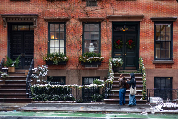
The taxi gives the scene its affection. New Yorkers will recognize the annual business of getting a tree home; former New Yorkers may feel a sudden, inconvenient urge to book a flight. Either way, this is a lovely card for keeping a city in the correspondence.
9. sugar paper: warmth of the holiday.
Sugar Paper’s Warmth of the Holiday gives a family photograph a beautifully considered setting. Letterpress and gold foil frame a photograph printed and attached by hand, with paper choices including Coastal Blue, Racing Green and Mulberry. Quantities begin at 50, and a designer prepares a proof for approval.
Coastal Blue would be particularly appealing with a black-and-white image. The cooler paper gives the photograph space, while the foil supplies a little winter light.
Choose a picture with some life in it: an exchanged glance, wind in someone’s hair, a moment that recalls the people rather than the arrangements required to photograph them. The formal production can comfortably accommodate an informal image.
10. moma design store: snowstar.
Peter Dahmen’s Snowstar introduces the pleasure of discovering how something works. Pop-up elements and foil embellishments turn the card into a dimensional object; the greeting is “Season’s Greetings,” and the set contains eight cards with white envelopes.
Send it to the person who will open it twice: once for the effect, then again to inspect the construction. Paper engineering appeals to a very satisfying combination of curiosity and delight.
It is also a good choice when you want the card to remain in view. A small sculpture on a desk can keep a greeting present long after the envelope has gone.
a few things worth feeling before you order
Printing methods contribute different pleasures. Letterpress presses ink into the paper and may leave an impression; engraving produces raised ink. Foil introduces a reflective surface, while lithography can render color and illustration with considerable subtlety. Some of the cards here combine several processes.
The design determines which treatment makes sense. Dear Annabelle’s engraved outlines lend definition to the illustrations. Sugar Paper uses foil alongside letterpress and photography. Cambridge Imprint’s folding construction creates depth through the paper itself. A heavier stock or deeper impression is only one part of the experience.
Envelopes deserve attention, too. Their color can prepare the eye for what follows, and a lining can make opening the card feel unexpectedly generous. For a card accompanying a host gift, that first glimpse becomes part of your arrival.
begin before december acquires other ideas
Ready-made cards and personalized stationery operate on different calendars. Greenwich Letterpress specifies three to four weeks for printing after design approval. Sugar Paper’s Warmth of the Holiday requires four to five weeks after proof approval. Those production periods leave addressing, writing and mailing still to come.
For custom December correspondence, October is a comfortable time to begin. Have the photograph, wording and address list ready so that a proof can be approved promptly. For cards arriving from Britain, allow for international delivery as well as the time you want to spend writing them. Scribble & Daub currently advises allowing up to two weeks for U.S. delivery.
Check the finished envelope before buying postage for the whole batch. Size, thickness, weight and dimensional construction can affect mailing requirements, particularly when a card has ambitions beyond lying flat.
give the handwriting something to do
The most memorable sentence in a holiday card often recalls something small: the lunch that ran into dinner, a kindness during a difficult month, a plan you are still determined to make happen. A printed greeting establishes the season; the handwritten line recognizes the person.
“I’m still thinking about our afternoon in June, and hoping for another before winter is over” carries more warmth than a paragraph of general good wishes. For a professional contact, name the judgment, generosity or partnership you appreciated. For someone who has had a hard year, leave room for the season to feel complicated.
Our essay The Note Is Part of the Gift follows that relationship between the object and the words. A beautiful card gives you an excellent beginning. The sentence only you could write makes it worth keeping.
Within Lantern Weather, this is one of the smallest ways to send a little light into another home. A ladder to the moon, a fox in the snow, a familiar hand on an envelope: each can make an ordinary December afternoon feel briefly, specifically, brighter.
ask vale
For help choosing the card or finding the words, ask Vale: “Help me choose distinctive holiday stationery for close friends and professional contacts, then write a short message for each that feels warm, personal and like me.”
faqs:
where can i buy distinctive luxury holiday cards online?
Start with Greenwich Letterpress for personalized letterpress stationery, Scribble & Daub for hand-painted cards, Choosing Keeping for a curated London selection, and Dear Annabelle for illustrated winter notecards. Other distinctive sources include Hammerpress, Cambridge Imprint and Meticulous Ink. Dempsey & Carroll, Sugar Paper and MoMA Design Store offer engraved, photographic and pop-up options.
which independent stationers make letterpress holiday cards?
Hammerpress prints letterpress holiday cards in Kansas City, while Meticulous Ink offers cotton-paper Christmas cards printed on a Heidelberg Windmill. Scribble & Daub combines letterpress printing with individual hand painting. Greenwich Letterpress’s personalized stationery can also carry a handwritten holiday greeting. Check the selected design, since printing methods vary within a stationer’s range.
which british stationery shops and makers are worth knowing for holiday cards?
Choosing Keeping in Covent Garden is a strong shopping source, while Scribble & Daub, Cambridge Imprint and Meticulous Ink offer distinctive cards through their own websites. Their approaches differ: hand-painted letterpress, lithographically printed folding cards and typographic letterpress are all represented. A British retailer may also stock cards made elsewhere, so check each product’s origin.
are dear annabelle’s frosty notecards letterpress printed?
Dear Annabelle describes its Frosty Notecards as combining flat printing with engraved outlines. The set contains ten heavyweight cards, with two each of five winter illustrations and coordinating envelopes. They are suitable for seasonal notes and winter thank-yous, rather than being a letterpress Christmas-card recommendation.
can personal stationery be used for holiday cards?
Yes. Personal stationery is an excellent choice when you want to write the seasonal message yourself. Greenwich Letterpress’s Festive Frogs, for example, offers personalized cotton-paper letterpress cards with room for a handwritten note. Choose a design that suits the recipient and make the occasion clear in your greeting.
when should i order personalized holiday cards?
Begin in October for custom cards intended for December mailing. Greenwich Letterpress currently lists three to four weeks for printing after design approval; Sugar Paper specifies four to five weeks after proof approval for Warmth of the Holiday. Confirm the current schedule and allow additional time for delivery, writing, addressing and postage.
what should i write in a luxury holiday card?
Write a warm greeting and add one detail specific to the recipient: a shared memory, something you appreciate or a plan you look forward to. For professional contacts, acknowledge a particular contribution. For someone grieving or having a difficult year, use gentle language that allows room for their experience, such as wishing them moments of peace in the season ahead.