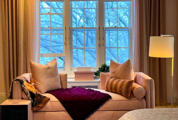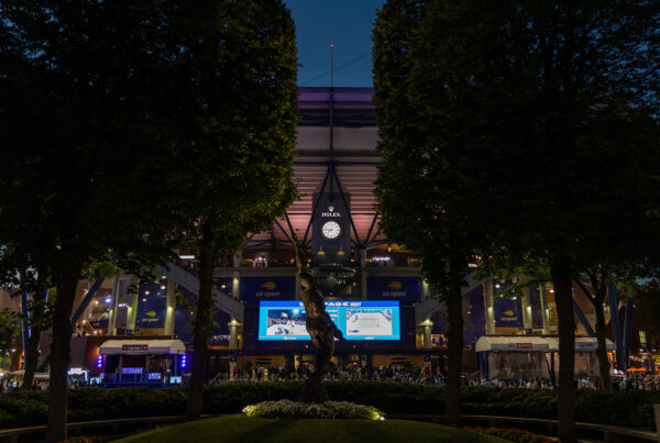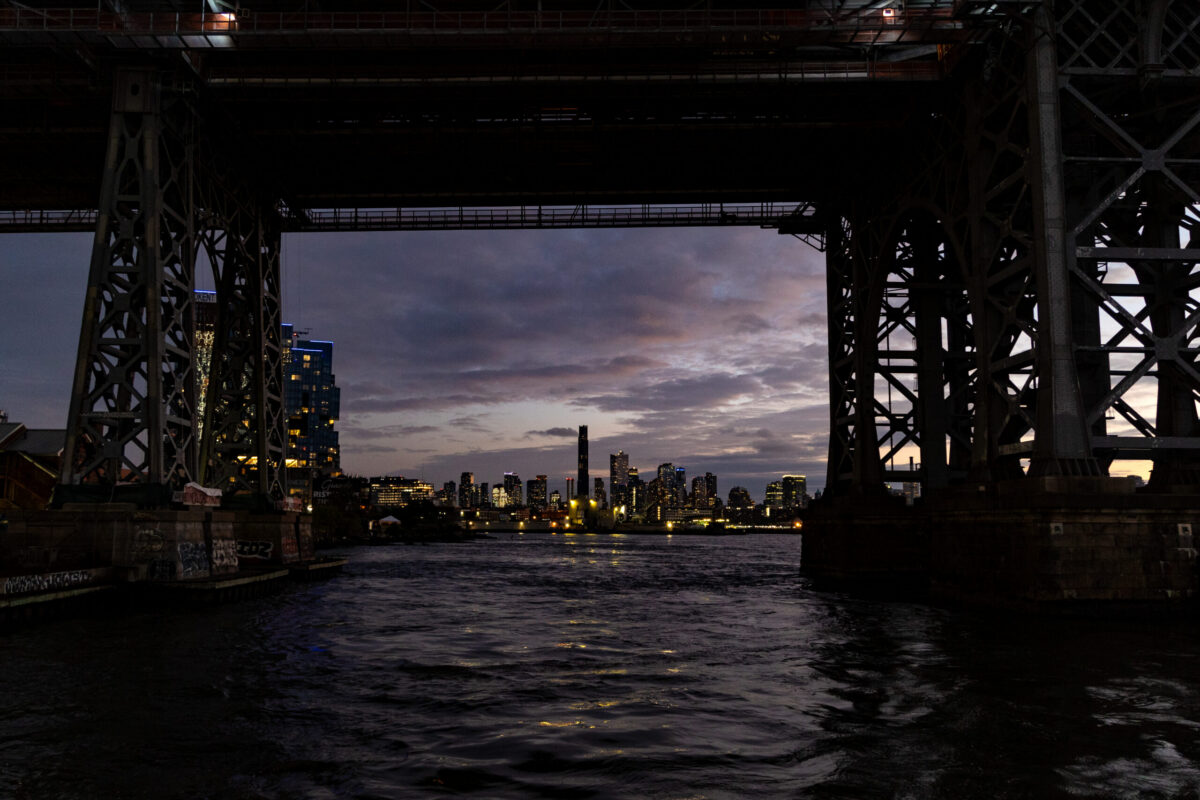
The best way to wear twilight colors is to understand that the light is not background. It is part of the outfit. Twilight is not a single purple-blue mood, but a complete palette of shadow, mist, reflected light and afterglow: fifteen atmospheric shades whose character changes as the light moves. Hemlock Ink can appear almost black until its blue-green undertone emerges. Winter Plum becomes warmer under lamplight. Silver Mist turns from quiet gray to cool sheen. Honey Frost holds the last light as if reluctant to let the evening begin.
Choose one shade to anchor the outfit, a second to change its temperature or mood, and one form of restraint to keep the composition clear. Hemlock Ink gains warmth from Alabaster Glow. Winter Plum becomes lighter and more modern beside Ice Blue. Pine Smoke needs only a controlled flash of Candle Gold. The colors do not merely match; they alter one another. Fabric, proportion and setting change them again. The Color Desk palette contains fifteen named shades, but light is the sixteenth color, completing the composition each time the wearer moves from window to street, office to dinner, daylight to dusk.
The Color Desk is Dandelion Chandelier’s Style & Identity series on how to wear color with intelligence, pleasure, strategy, and a little well-placed mischief.
At a glance: twilight color palette • fifteen atmospheric shades • Shadow & Mist • Light & Glow • unexpected color pairings • fabric and finish • dressing for changing light
All photographs are by Pamela Thomas-Graham for Dandelion Chandelier. For more on twilight colors, bookmark our luxury gift guide in twilight colors, The Best Light Comes Last.
twilight is not one color
Twilight is usually reduced to purple, perhaps with a little navy added if someone has been feeling adventurous. The actual hour is far less obedient. As the sun moves below the horizon, color does not simply darken. It cools, diffuses, reflects, intensifies and occasionally produces one last flare of warmth before disappearing.
The U.S. Naval Observatory divides twilight into civil, nautical and astronomical phases according to the sun’s position below the horizon. For dressing purposes, the more interesting fact is that twilight is a changing light condition. Cloud, weather, glass, stone, water, streetlamps and the horizon itself all affect what remains visible and which colors rise to the surface.
Photographing at this hour teaches you to distrust the first color you see. A gray street may reveal green in the stone, violet in the glass and bronze along wet pavement. Black becomes ink or blackberry; white becomes pearl or ice. Twilight colors tend to contain another color just beneath the first, rewarding a second look in clothes and in people.
That instability is why twilight has become a recurring visual language across my photography and When Words Fail. The hour between daylight and darkness is never merely pretty. It is unsettled, clarifying and alive to what light can reveal just before it leaves. The palette in this guide began with that act of looking.

Amethyst, edged in shadow.
the twilight color family
The Color Desk palette contains fifteen editorial shades, named for the undertones, surfaces and emotional signals that emerge as daylight recedes. Shadow provides depth. Mist softens and suspends. Light introduces clarity. Glow supplies warmth. An outfit may remain within one register, but the strongest combinations usually allow two of them to meet.
The darker half moves from Hemlock Ink and Blackberry Velvet through Winter Plum, Evergreen Shadow and Pine Smoke. Silver Mist and Moonlit Pewter form the hinge between darkness and illumination. Frosted Glass, Ice Blue, Snow Pearl and Alabaster Glow catch cool or mineral light, while Candle Gold, Ember Bronze and Honey Frost hold the warmth that remains.
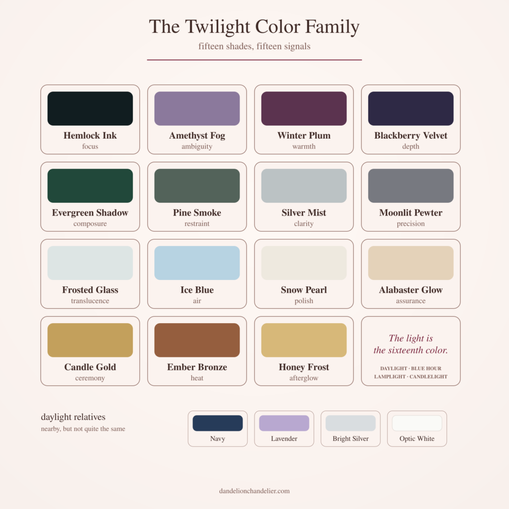
The names are descriptive, but the signals are where the system becomes useful. Hemlock Ink is not merely a dark teal-black. Its particular value is authority without black’s finality. Honey Frost is not simply pale gold. It carries warmth without the full ceremony of metallic gold. Winter Plum has enough red to retain appetite and enough violet to enter shadow.
Color becomes easier when it has a job. The question is not whether a shade is beautiful in isolation. The question is what it contributes once the outfit, the wearer and the room begin speaking at the same time.
the daylight relatives.
The distinctions at the bottom of the chart matter. Hemlock Ink is related to navy, but it contains enough green and black to feel less conventional. Amethyst Fog is not lavender; gray has removed the sweetness and left ambiguity behind. Silver Mist is quieter than bright silver. Frosted Glass has translucence and blue inside it, where optic white is crisp and declarative.
The daylight relatives reveal what twilight has changed. Shadow, diffusion or reflected warmth alters each color’s social register: navy becomes mysterious, lavender cerebral, white atmospheric and silver responsive to the room.
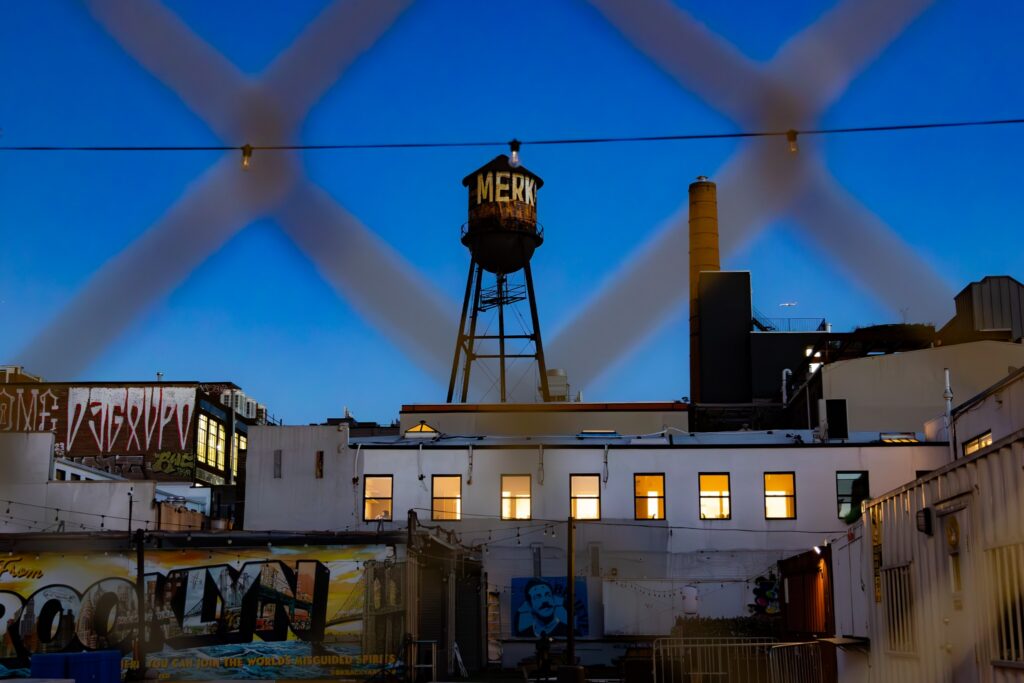
Blue hour, crosshatched.
shadow and mist: the colors that deepen
The Shadow and Mist register contains Hemlock Ink, Amethyst Fog, Winter Plum, Blackberry Velvet, Evergreen Shadow, Pine Smoke, Silver Mist and Moonlit Pewter. These colors create authority, ambiguity and atmosphere through depth rather than saturation. They can perform many of the duties assigned to black, navy, brown and gray while carrying more emotional information.
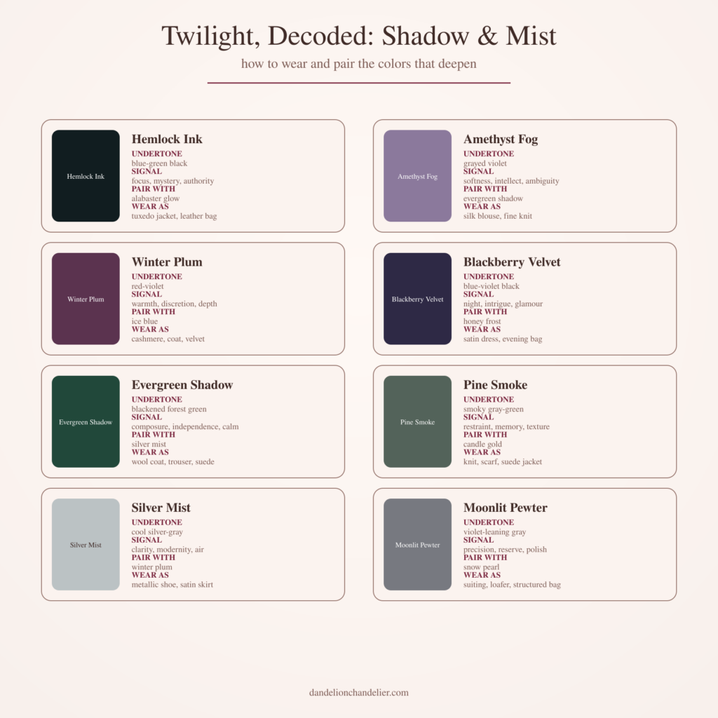
Hemlock Ink and Blackberry Velvet sit closest to black, but they do different social work. Hemlock Ink carries blue-green beneath its darkness, giving it focus and architectural authority. Blackberry Velvet contains blue-violet, making it more nocturnal and intimate. One belongs naturally in tailoring and leather; the other comes alive in satin, velvet and small evening accessories.
Winter Plum and Amethyst Fog occupy the expressive middle. Winter Plum retains warmth and appetite, making it persuasive in cashmere, velvet or a beautifully cut coat. Amethyst Fog is softer and more cerebral. It suits silk or a fine knit because movement allows its violet-gray ambiguity to remain visible.
Evergreen Shadow and Pine Smoke bring living color into the dark. Evergreen Shadow is blackened forest green with composure built in; Pine Smoke is grayer, quieter and more textural. Silver Mist and Moonlit Pewter then introduce enough cool metal and air to keep the register from becoming enclosed. They are not decorative accents so much as pressure-release valves.
light and glow: the colors that catch the light
The Light and Glow register contains Frosted Glass, Ice Blue, Snow Pearl, Alabaster Glow, Candle Gold, Ember Bronze and Honey Frost. These are not pastels in the confectionery sense or metallics in the red-carpet sense. They are colors of reflected illumination: cool sky, pale stone, pearl, candlelight, copper and the last warm band along the horizon.
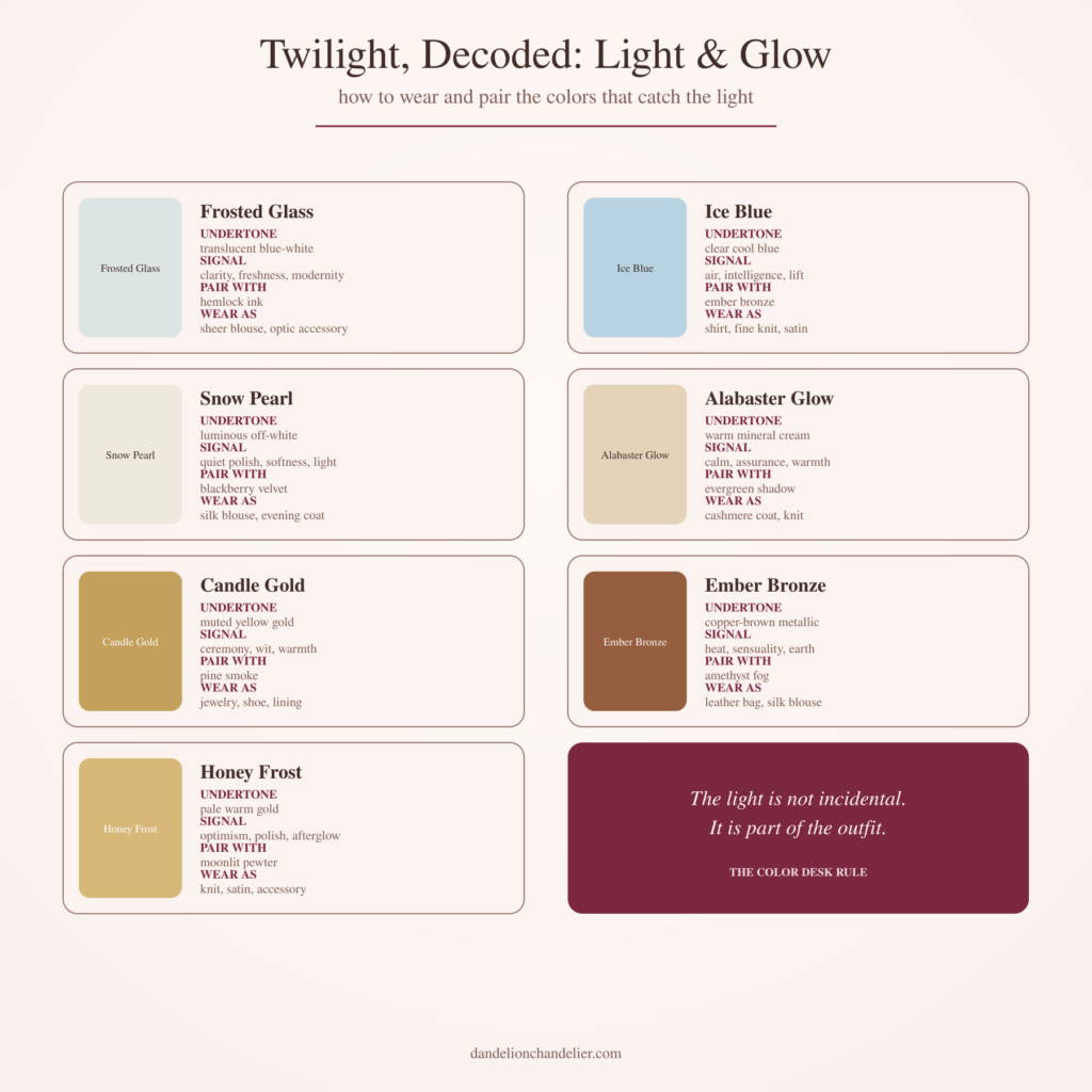
Frosted Glass is blue-white with translucence built into the idea. It is persuasive in sheer fabric, crisp cotton, glassy jewelry or an optic accessory. Ice Blue is clearer and more direct. Near the face, it can introduce lift; in satin, it becomes almost liquid.
Snow Pearl and Alabaster Glow are the palette’s two whites, although neither is truly white. Snow Pearl is cool, luminous and quiet. Alabaster Glow has mineral warmth and greater assurance. This is the distinction between a silk blouse that appears to catch moonlight and a cashmere coat that seems to store the last warmth of the day.
Candle Gold, Ember Bronze and Honey Frost offer three degrees of glow. Candle Gold is muted and ceremonial. Ember Bronze has earth and heat. Honey Frost is paler, gentler and more optimistic. All three are best used with some discipline because twilight needs one source of glow, not competing light fixtures.
twilight colors need a counterweight
The obvious partner for a dark color is another dark; for gold or bronze, another warm neutral. Both can be handsome, but the eye has already written the ending. Twilight colors become more modern when the second shade introduces air, structure, warmth or shadow.
This is the larger Color Desk framework of anchor, tension and restraint. The anchor stabilizes the composition. The tension makes the eye pause. The restraint keeps the outfit from explaining the idea three more times.
pairing shadow and mist.
Hemlock Ink with Alabaster Glow is the most polished version of darkness meeting light. The blackened green gives the cream intelligence; the mineral warmth prevents the dark from becoming austere. Amethyst Fog with Evergreen Shadow works differently. The green gives structure to the violet haze, while the haze makes the green feel more unexpected than it would beside camel or navy.
Winter Plum with Ice Blue is a study in temperature: red-violet warmth interrupted by clear cool air. Blackberry Velvet with Honey Frost is the evening pairing, because pale gold does not compete with the near-black violet; it reveals it. Pine Smoke with Candle Gold follows the same logic more quietly, like smoke with one controlled flame.
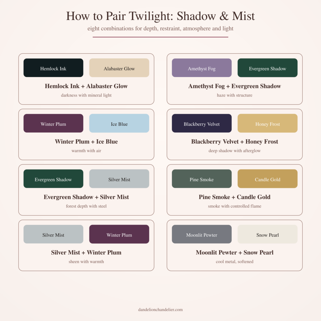
Silver Mist with Winter Plum and Moonlit Pewter with Snow Pearl are the lower-volume combinations. They work when the desired effect is polish rather than drama, and they are especially useful for professional rooms in which color should be perceptible without becoming the subject of the meeting.
pairing light and glow.
Pale and reflective colors need darkness for definition. Without it, a Light and Glow outfit can become vaporous; with too much, the effect turns graphic and loses the softness that made the colors interesting. The right partner gives the light an edge while allowing it to remain light.
Frosted Glass with Hemlock Ink is translucence with one hard boundary. Snow Pearl with Blackberry Velvet is softer, because the violet-black makes the pearl visible without forcing a stark black-and-white contrast. Alabaster Glow with Evergreen Shadow feels warmer and more organic, particularly in matte wool, cashmere and suede.
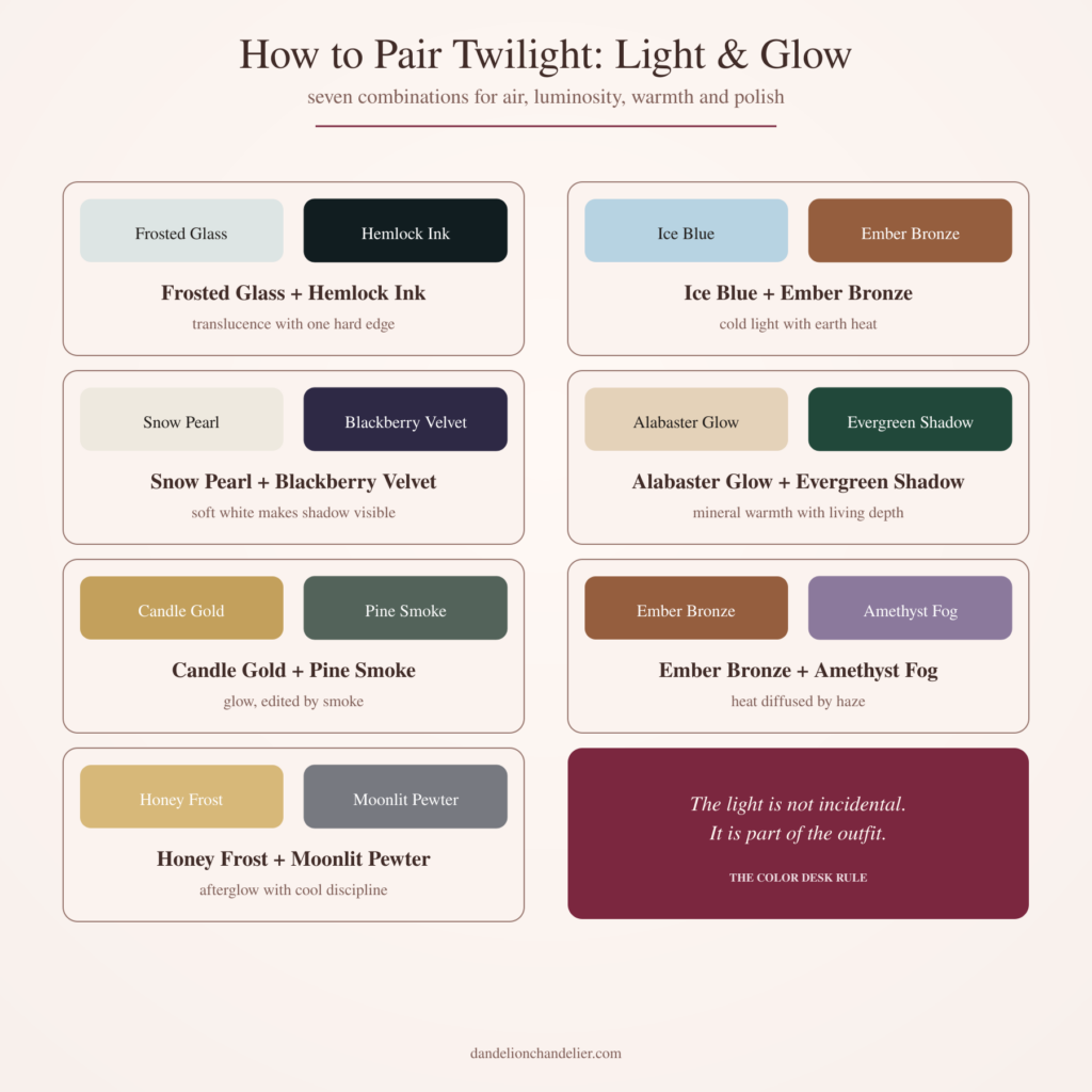
Ice Blue with Ember Bronze may be the most surprising combination in the palette. The blue supplies cold light; bronze provides earth heat. Neither color gets to become its cliché. Ice Blue stops looking innocent, and bronze stops looking rustic. Candle Gold with Pine Smoke, Ember Bronze with Amethyst Fog and Honey Frost with Moonlit Pewter operate by the same principle: the partner color is not there merely to coordinate. It decides which quality of the first color survives.
how to use the twilight dial
There is a quicker way to use the palette when fifteen names feel like one decision too many. Think of each outfit as sitting somewhere on four sliding scales:
shadow ←→ light
cool ←→ warm
matte ←→ reflective
daylight ←→ after dark
Hemlock Ink sits close to shadow, coolness and matte authority. Candle Gold moves toward warmth, reflection and evening. Silver Mist is cool and reflective but sufficiently quiet for daylight. Winter Plum can move in either direction depending on fabric: matte cashmere makes it discreet enough for a serious day; velvet or satin draws it toward evening.
Instead of asking, “Do these colors go together?” ask what the outfit needs next. If it is already deep and cool, perhaps it needs warmth or reflection. If it is pale and luminous, perhaps it needs one dark line. If the fabric is doing a great deal, the silhouette may need to become quieter. The dial replaces matching with calibration, which is generally where grown-up style becomes much more interesting.
- Choose the anchor. Begin with the largest or most stabilizing field of color. Hemlock Ink, Evergreen Shadow, Winter Plum, Pine Smoke and Moonlit Pewter are natural anchors; Alabaster Glow can anchor a pale composition.
- Introduce the counterweight. Decide what the anchor lacks, then add air, warmth, shadow or reflection. The second color should change the first rather than simply agree with it.
- Let the light provide the restraint. Check the outfit near a window, under office lighting and in the lower light in which it may eventually be worn. If the palette is complex, simplify the silhouette. If the fabric is lush, quiet the accessories.
three twilight palettes that work
Pairs explain relationships, but a complete outfit often needs a third note. These palettes translate the system into compositions for three rooms where color matters.
for work: hemlock ink, alabaster glow and moonlit pewter.
Hemlock Ink supplies authority without the finality of black. Alabaster Glow brings warmth toward the face, while Moonlit Pewter introduces precision through a shoe, trouser, watch or structured bag. The palette reads as composed rather than decorative, and each color has a distinct assignment.
for art and culture: winter plum, ice blue and silver mist.
Winter Plum provides depth and appetite; Ice Blue opens the composition; Silver Mist adds a cooler point of polish. A plum coat over an ice-blue knit with one silver or pewter accessory can move through a gallery afternoon, museum dinner or opening without looking as if it dressed for the art.
for evening: blackberry velvet, snow pearl and honey frost.
Blackberry Velvet establishes the night. Snow Pearl makes its violet undertone visible, and Honey Frost supplies a narrow band of afterglow through jewelry, a bag or a satin detail. The effect is glamorous because the light is rationed, not because every surface has been asked to shimmer.
fabric changes the hour
Twilight colors are unusually sensitive to material because so many live near the boundary between one color and another. Velvet absorbs light and makes Winter Plum or Blackberry Velvet appear deeper. Satin returns light and gives Ice Blue, Silver Mist and Snow Pearl movement. Cashmere softens contrast. Leather sharpens it. Suede brings Evergreen Shadow, Pine Smoke and Ember Bronze closer to earth.
Metallic finishes require particular judgment. The most modern version of Candle Gold is often brushed rather than mirror-bright. Pewter is more versatile when it reads as a cool neutral before it reads as shine. Bronze looks richer when the surface reveals irregularity and depth. Daytime shine should catch the light rather than demand its own spotlight.
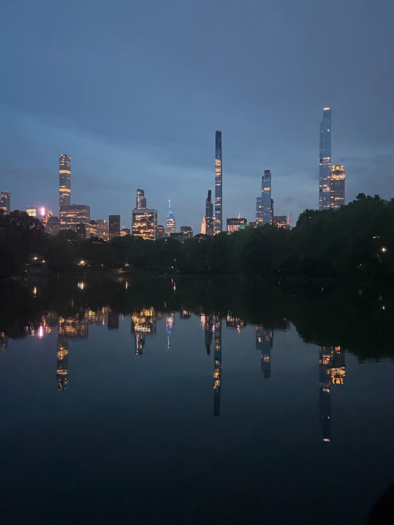
The city becomes light.
Through the camera, these differences become unmistakable. Satin can collect a passing streetlamp and carry it across the frame; velvet may swallow the same light and reveal only a saturated edge. Wet pavement turns silver into blue and bronze into flame. Glass can place several versions of the evening in one image. Clothes undergo the same transformations, which is why checking a twilight color in only one kind of light tells you almost nothing about its full character.
This is one reason the dark-red family and the twilight palette speak so naturally to one another. Both depend on undertone, surface and changing light. A color that looks sober in wool may become intimate in silk and faintly dangerous in patent leather. The shade provides the vocabulary; the fabric decides the tone of voice.
the rooms twilight knows how to enter
The most useful way to dress with color is to think about rooms rather than occasions. Rooms have light, hierarchy and social temperature, even when the invitation offers nothing more illuminating than “drinks.” Twilight colors move easily between authority and atmosphere.
the room where authority matters.
For a board meeting, presentation, client dinner or serious professional lunch, begin with the darker register. Hemlock Ink, Evergreen Shadow, Winter Plum and Moonlit Pewter can perform many of the functions usually assigned to black, navy and charcoal while carrying more emotional information.
Keep the strongest color in a structured piece: jacket, trouser, coat, loafer or bag. Introduce light through Alabaster Glow, Snow Pearl or Silver Mist, then stop. This is Call to Order territory, where clothing is asked to remove static rather than generate commentary.
the room where everyone has looked at art first.
A gallery opening, museum dinner or serious art fair permits more ambiguity. Amethyst Fog, Blackberry Velvet, Winter Plum, Silver Mist and Ember Bronze register as color without looking determined to outperform the installation. They also respond beautifully to shifting wall colors, spotlights and shadow.
The essential discipline is proportion. Let one unusual color occupy the largest field and another appear as a smaller interruption. Our guide to what to wear to Art Basel and every other serious art fair makes the larger case: cultural fluency is visible, but effort should not be.
the room where the lights have gone down.
Dinner, theater, a hotel bar or an evening reception is where Blackberry Velvet, Winter Plum, Candle Gold and Ember Bronze earn their keep. The color can deepen and the surface can begin to move, but one reflective element remains enough. Plum velvet, a bronze bag and gold jewelry may each be excellent; all three together have started a committee.
Dusk & the City lives in this transition, when color changes, texture matters more and shine has to be rationed. Twilight colors make an especially elegant alternative to pure black after sunset because they retain black’s discipline while responding more visibly to the room.
the room you have traveled to enter.
Travel is where a twilight palette becomes both practical and observant. Fifteen colors do not belong in the suitcase, but three or four can respond to place. A rainy northern city might suggest Moonlit Pewter, Pine Smoke, Snow Pearl and Blackberry Velvet; a warmer landscape, Alabaster Glow, Ember Bronze, Honey Frost and Winter Plum.
The point is not to dress like the destination. It is to notice the local light and allow your clothes to have a conversation with it. That is the difference between costume and attention.
This is the essence of The Color Desk: color as composition, communication, mood and strategy. Matching is a small part of the assignment. Meaning is the larger one.
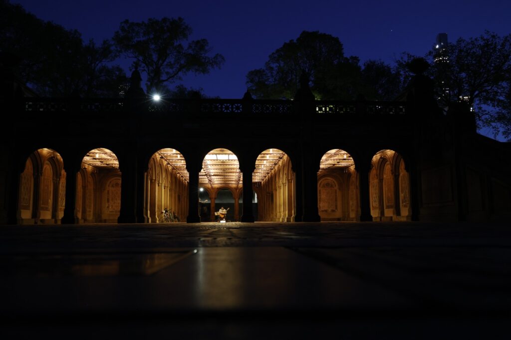
Night enters through gold.
the final word: let the light finish the outfit
Twilight colors are not reserved for autumn, evening or people who own an implausible amount of velvet. They are a seasonless palette of complex darks, softened neutrals, cool light and controlled warmth. Fabric determines when they can be worn; proportion determines how much they say; light decides which undertone the room will see first.
Their deeper appeal is that they resist instant legibility. Hemlock Ink is not quite black. Snow Pearl is not quite white. Winter Plum hovers between warmth and shadow. Ember Bronze shifts between metal and earth. These colors do not announce themselves and then retire from the conversation. They continue changing as the wearer moves.
That is why twilight is such fertile territory for style. Daylight tells the truth rather bluntly. Darkness withholds it. Twilight permits several truths to coexist, which is generally more elegant and considerably closer to life. The light is not merely revealing the outfit. It is the sixteenth color.
faqs:
what are twilight colors?
Twilight colors are atmospheric shades associated with the changing light between day and night. They include near-black blue-greens, plums, smoky greens, silver and violet grays, ice blue, pearl, mineral cream, muted gold and bronze. In this Color Desk palette, the 15 shades are organized into Shadow, Mist, Light and Glow.
how do you wear twilight colors?
Choose one twilight color as the anchor, add a second shade that changes its temperature or mood, and use restraint in silhouette, texture or accessories. For example, pair Winter Plum with Ice Blue, Hemlock Ink with Alabaster Glow or Pine Smoke with Candle Gold. The goal is controlled contrast rather than simple matching.
what colors pair well with twilight purple and plum?
Twilight purple and plum work especially well with ice blue, smoky green, pale gold, pearl, pewter and mineral cream. Winter Plum becomes lighter and more modern beside Ice Blue, while Blackberry Velvet gains definition from Honey Frost or Snow Pearl. The best partner usually introduces air or reflected light.
can twilight colors be worn during the day?
Yes. Twilight colors are seasonless and can be worn in daylight when fabric and proportion are calibrated correctly. Matte cashmere, wool, cotton, leather and suede make deep twilight shades suitable for day. Silver, gold and bronze work best before sunset in brushed, muted or limited doses.
are the Color Desk twilight names official color standards?
No. Hemlock Ink, Amethyst Fog, Alabaster Glow and the other names in this guide form an original Dandelion Chandelier editorial palette. They are a practical language for undertones, signals, pairings and wardrobe uses, not official Pantone, Munsell or industry-standard color designations.
what is the difference between Shadow and Mist colors and Light and Glow colors?
Shadow and Mist colors provide depth, atmosphere, authority and ambiguity. They include Hemlock Ink, Winter Plum, Evergreen Shadow and Moonlit Pewter. Light and Glow colors provide clarity, air and reflected warmth. They include Frosted Glass, Ice Blue, Snow Pearl, Candle Gold and Ember Bronze.
what fabrics look best in twilight colors?
Velvet deepens plum and violet-black; satin gives ice blue, silver and pearl movement; cashmere softens contrast; leather adds authority to dark green, ink and bronze; suede emphasizes smoky and earthy undertones. Because twilight colors change with surface and light, fabric is part of the color decision rather than a separate consideration.