
What is the true color of modern luxury? Does luxury even have a color? In our ongoing series, we’ll examine just that. In this edition, we consider the color green. What is the meaning of the color green? What does the color green symbolize? Which luxury brands have green logos? Could green be the true color of modern luxury?
what is the true color of modern luxury?
What do you think – what is the color of luxury? Does it change over time, or is it fixed?
Getting this right is mission-critical for luxury brands, as color is one of the most memorable elements of any brand logo. According to ColorMatters, 80% of what people remember when they see visual information is related to color.
When most people are asked about the color that best evokes luxury and wealth, the response is purple. In the Holy Roman Empire, the dye used to produce the emperor’s purple clothes was extremely expensive to produce, and therefore rarely seen on anyone other than royalty.
One could also argue for gold, for obvious reasons. Red was the color of nobility during the Renaissance. Modern luxury brands have migrated in the past few years toward either brilliant white or glossy black as signifiers of luxury.
is it green?
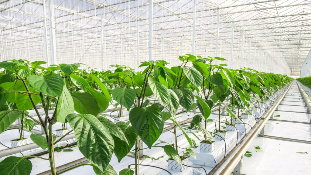
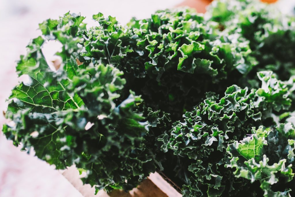
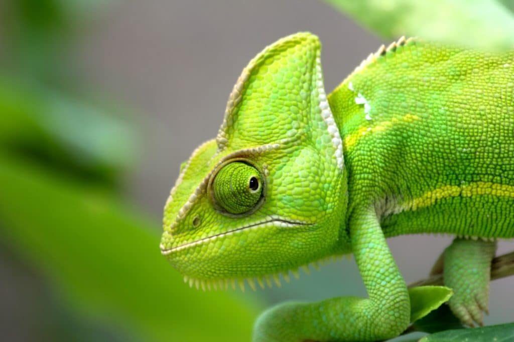
When you think about it, green has a very strong case as the perfect embodiment of modern luxury. After all, it’s the color of money; the hue of the single-zero on the roulette tables of Monte Carlo; the shade of the golf course at Augusta; the tint of verdant lawns the world over; the color of kale. British racing green is without a doubt the best color for a Jaguar.

green has already been named the color of the year
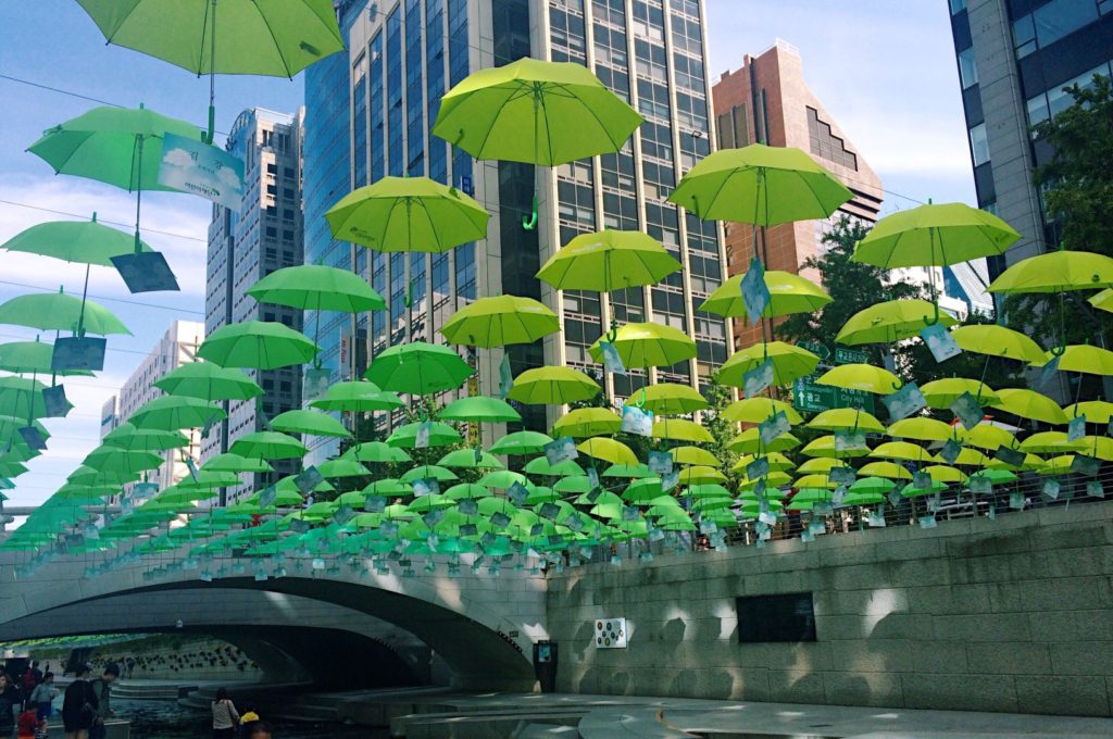
In 2017, the Pantone Color Institute named Greenery the Color of the Year. According to the company, the yellow-green hue (Pantone 15-0343) was chosen because it embodies the concept of “environment,” beginnings, healthy food resolutions, grass and the outdoors. The color was immediately adopted on several designer runways, including Prada, Gucci, Kenzo, and Balenciaga.
green can evoke luxury life
There are many positive emotions associated with green. Depending upon whether it’s a light or dark shade of green, the color evokes thoughts of summer in the Hamptons; croquet matches on the lawn; luxurious eco-resorts in the South Pacific; manicured gardens in Paris; tennis at Wimbledon; evergreen forests; the Northern Lights; Tesla and other luxury electric vehicles; and Tina Turner’s stunning Armani wedding dress.
It plays well with gold, black, blue and silver, and if you choose the right shade of green, it can make you look fabulous.
although it also has some sinister and pedestrian undertones
Of course, there are also many negative emotions associated with the color green. It evokes the Wicked Witch from “The Wizard of Oz;” mold; seaweed; and feeling nauseated (think “green around the gills”).

Historically, in the West it represented the middle class. In Renaissance Italy, green was worn by merchants, bankers and the gentry, but not by the true elite – the Mona Lisa is depicted wearing green to indicate her lack of noble status. In the British Parliament, the benches in the House of Commons are green, while red is reserved for the House of Lords.
Green is deeply complex
One of the reasons that we personally love the idea of green as a signifier of luxury is that it’s intellectually challenging. The more you think about it, the more meanings you’ll find.
Green is complex, with many layers that exist in tension with each other:
New versus old.
Green can represent spring, freshness and youth – but verdigris, the dark green color of mellow aged copper and bronze, stands for something aged and enduring. As do ivy- and moss-covered buildings and gravestones, and ship hulls covered in lichen.

Healthy versus ailing.
Pharmacies in Europe frequently have green crosses on their storefronts to indicate health and wellness; green tea is marketed as a powerful antioxidant, and green coffee, found only in Costa Rica, is said to promote long life. Olives and olive oil are part of a healthy diet. But many things related to feeling ill or being unwell turn out to be green. And a “hothouse” or greenhouse flower is a person considered to be fragile and in need of protection.
Safe versus toxic.
Lots of healthy and safe food items are green: vegetables, limes, kiwis and some varieties of apples and grapes. Absinthe, on the other hand, could kill you. In the movies, chloroform and poison are usually depicted as green, and always used for nefarious purposes. In the film, Soylent Green was thought by the unsuspecting populace to be safe. And we all know how that turned out.
Manicured versus wild.
Golf courses and expensively-maintained lawns and gardens are domesticated green; jungles and forests are green still running wild.

Anodyne versus edgy.
Ophthalmologists report that green is the most restful color for the human eye (vision-intensive professionals like accountants and copy-editors used to wear green eye-shades at work to protect their eyes). Rooms decorated in green are said to have a calming and relaxing effect, and to be perceived as just the right temperature. In other words, green is a sedative, not a stimulant.
But some would say that the association of green M&Ms with rock-and-roll bands on tour adds a touch of wild abandon to green’s image. Interestingly, the green M&M personality created by candy-maker Mars for its ad campaigns is a sexy female with a Kathleen Turner-husky voice (launching rumors that green M&Ms are an aphrodisiac.)

A blessing versus a curse.
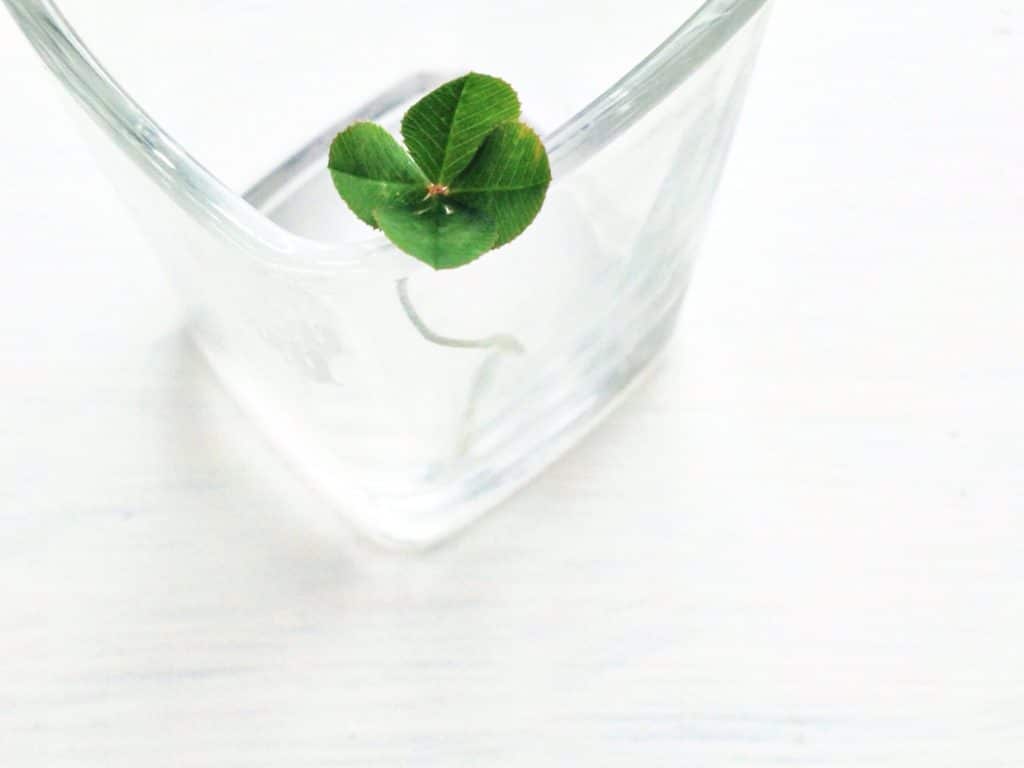
In various cultures, green can signify optimism and good fortune: for example, four-leafed clovers, the luck of the Irish, and the Emerald City in the Wizard of Oz (the dreamed-of place where all problems are solved). The Chinese associate green with happiness and fertility.
But in ancient Egypt, Osiris, king of the underworld, was depicted with a green complexion. As is Frankenstein’s monster. Shakespeare memorably described envy as “the green-eyed monster” in Othello and the Merchant of Venice. Snakes, crocodiles, lizards and dragons are generally depicted as being green (and predatory). Frogs and grasshoppers (aka locusts) were among the 10 Biblical plagues. And the New York Jets’ team colors are white and green, and they definitely have not symbolized good luck. At least not since January 1969. But there’s always next year.
Overt versus covert.
Many national flags have green as their primary color; this is in part because it is a holy color in Islam. Many grand residences in Istanbul – such as the stunning Dolmabahce Palace on the shores of the Bosporus Strait – prominently feature opulent crystal chandeliers with a multitude of green stones as a visible homage to the Muslim faith. But animals turn green when they need to hide, and soldiers wear olive drab and camouflage for undercover operations.
Out of reach versus easily accessible.
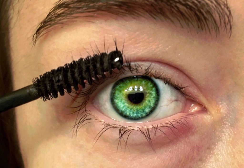
Emeralds and jade are expensive, and green eyes are extremely rare (only 2% of the population has them). Conversely, green public parks are free. Unfortunately, green space is an extreme rarity in poor urban environments, though, making it a precious luxury item for a significant portion of the world’s population.
All systems go versus not yet ready for takeoff.
Green traffic lights grant permission to move forward, and green lights on machines generally mean that they’re fully operational and functioning well. Green cards give one permission to stay in a foreign land. But green rooms are where people are in limbo, waiting to go on television. Green bananas are not yet ready to eat. And “greenhorn” or “too green” refers to the concern that someone is too inexperienced, and not yet ready for the task at hand.
heritage luxury brands with green logos
Given all of that, which luxury brands have adopted green prominently in their logos?
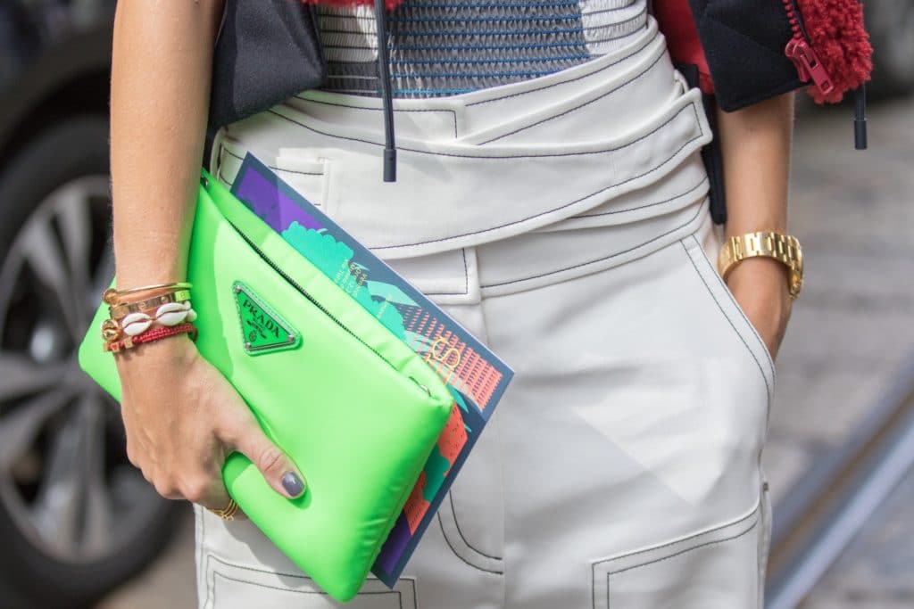
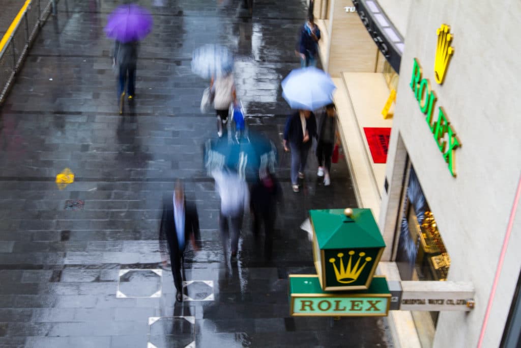
Rolex, Range Rover/Land Rover, La Mer, Harrods, Perrier, wealth management firm Northern Trust, luxury organic beauty brand Tata Harper and Starbucks come to mind. The iconic Lacoste crocodile is green. Dom Perignon and Jaguar use green occasionally, but not consistently. If you count the color of the bottle, you could add in San Pellegrino.
That’s not a particularly long list.
Interestingly, almost none of these brands skew strongly male or female – maybe green is one of the few things upon which men and women can agree.
the true meaning of green
When we reflect on the nature of green, we love it more and more as a candidate for the definitive color of luxury.
If the truest essence of luxury is a strong deep elusive desire, then green might well embody it better than any other color.
As F. Scott Fitzgerald’s Nick muses in the final lines of The Great Gatsby: “Gatsby believed in the green light, the orgastic future that year by year recedes before us. It eluded us then, but that’s no matter—tomorrow we will run faster, stretch out our arms farther.”
At its best, green means keep going.
see luxury in a new light
Come and join our community! For a weekly round-up of insider ideas and information on the world of luxury, sign up for our Dandelion Chandelier Sunday Read here. And see luxury in a new light.
power up
For a weekly dose of career insights and ideas, sign up for our Sunday newsletter, Power Up, here.


